What this case study is about
I broke down a few screens and proposed changes that could make the product clearer for users and more effective for the business.
I also decided to rethink the UI a bit — without tying it to Letterboxd's current brand identity — purely based on my own taste, and then turned the idea into a SwiftUI prototype.
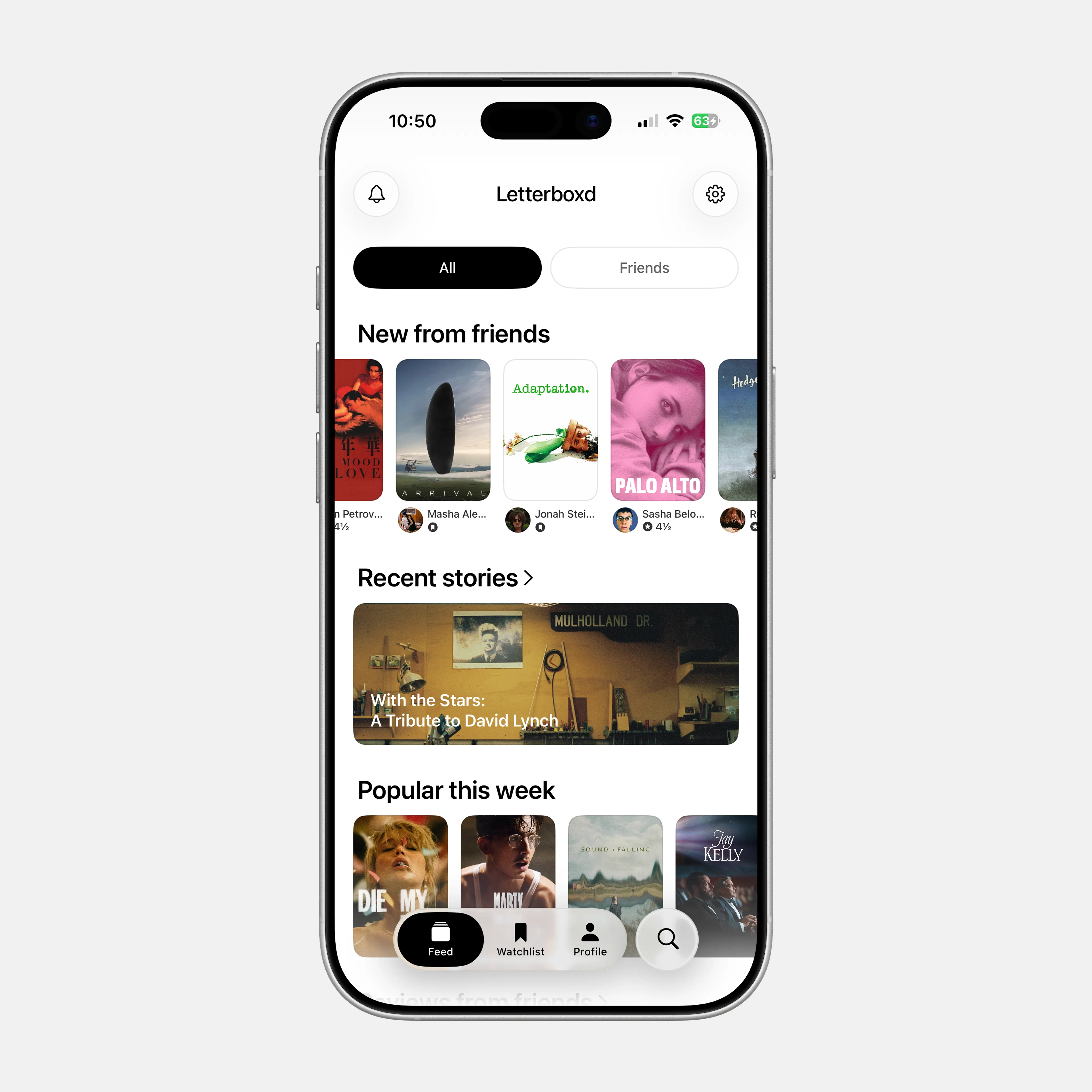
Home
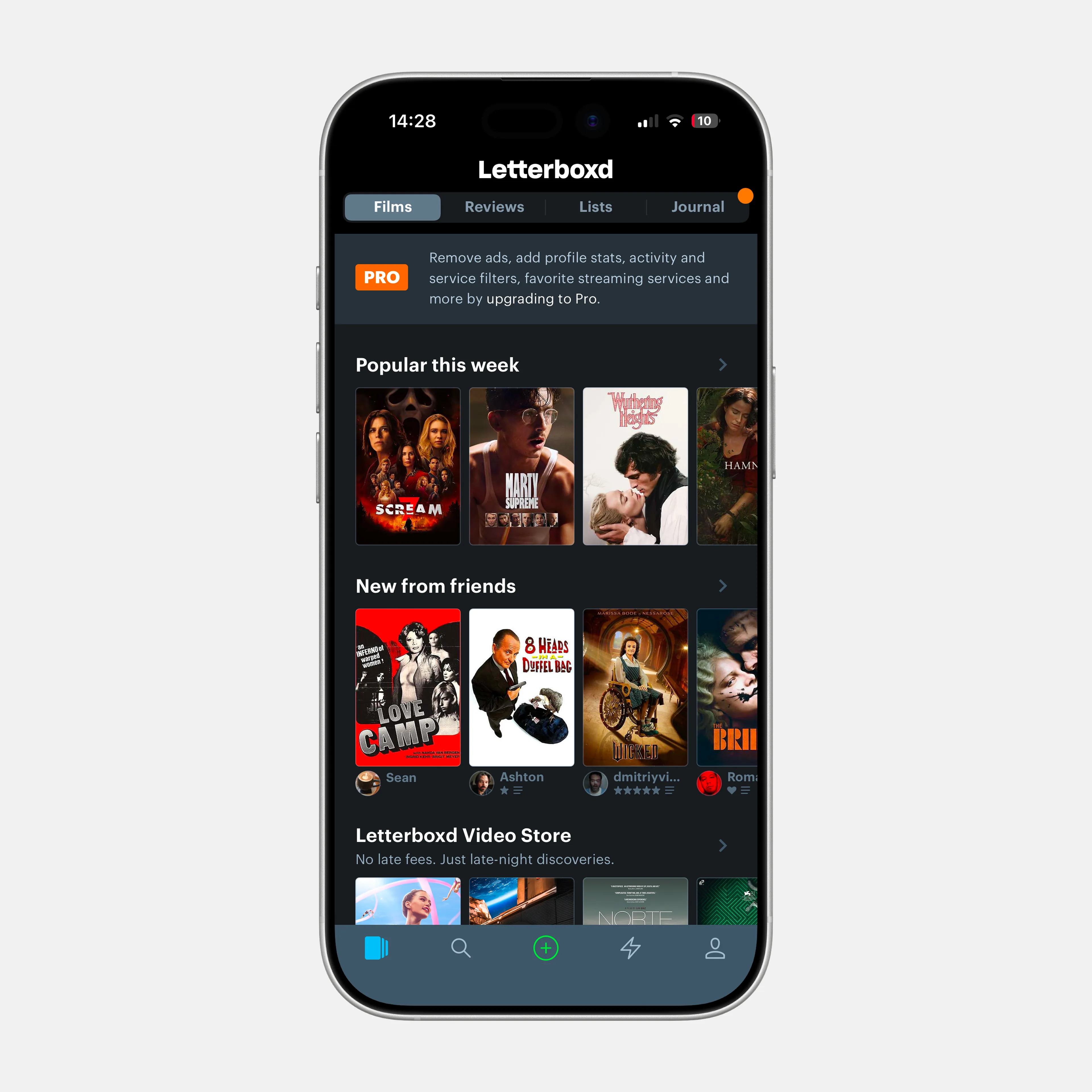
On Letterboxd's home screen, there are several tabs — films / reviews / lists / journal — and the app opens on the first one, films. After scrolling through a few horizontally scrolling blocks, the user gets to the bottom of the feed surprisingly fast. Some people will explore the other tabs, but I think most users will end their “journey” right there.
Modern social platforms have trained us to expect feeds that rarely, if ever, end. Hitting such an abrupt stop can feel confusing.
Imagine someone has just installed Letterboxd for the first time — they don't follow anyone yet and barely know what the product is about. In that scenario, the first screen shows them nothing but a list of popular films — none of the social side of the product, none of its editorial or entertainment value. I'd argue a certain share of new users is already lost at that point, and the Letterboxd icon probably won't stay on their home screen for long.
On one hand, I do appreciate that kind of digital minimalism, when a product doesn't overwhelm the user with information. But to me this feels like an extreme. Nobody really wins here — the business loses revenue, and users miss out on comments from friends, articles, and a lot more.
Solution
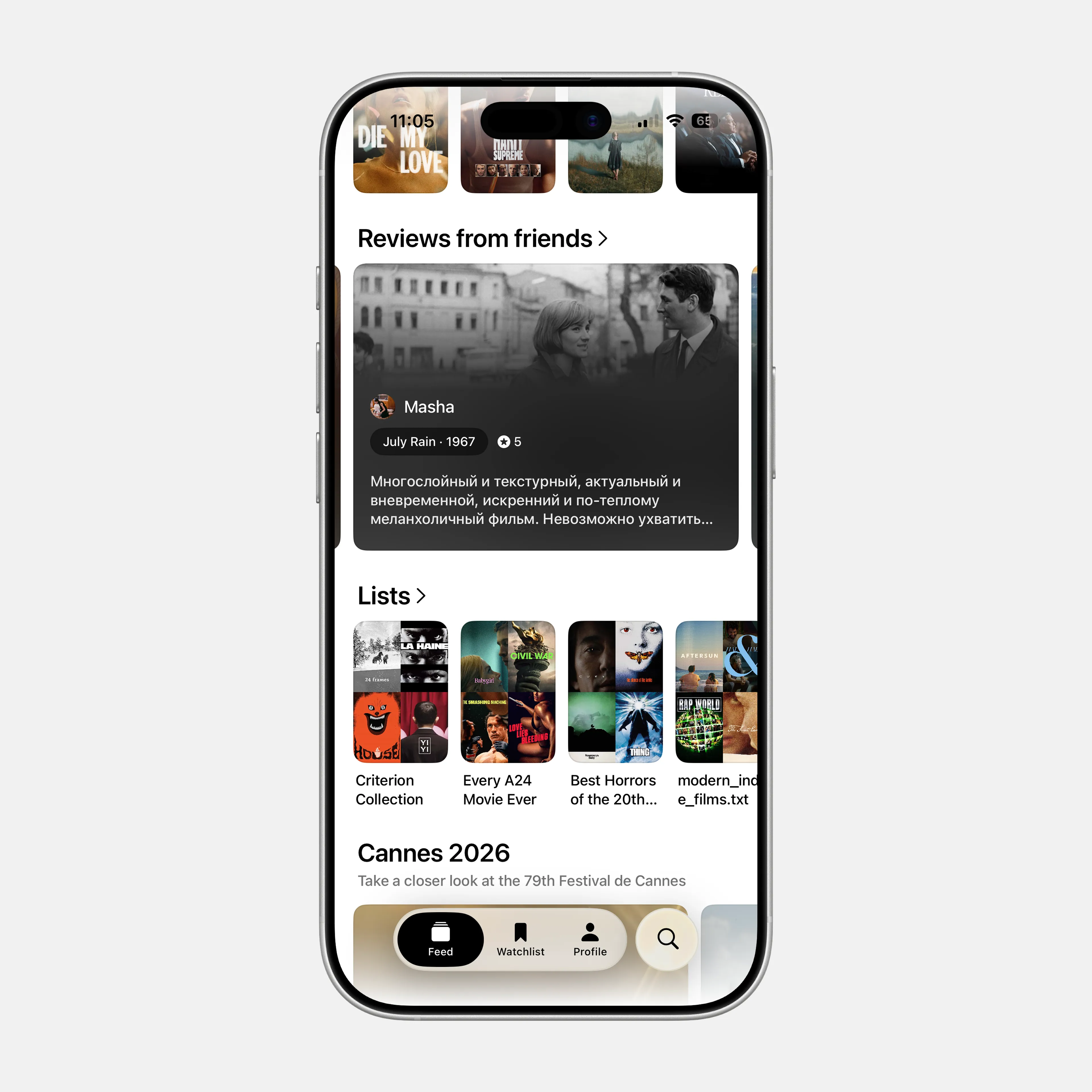
I decided to split the feed into two high-level sections — All and Friends.
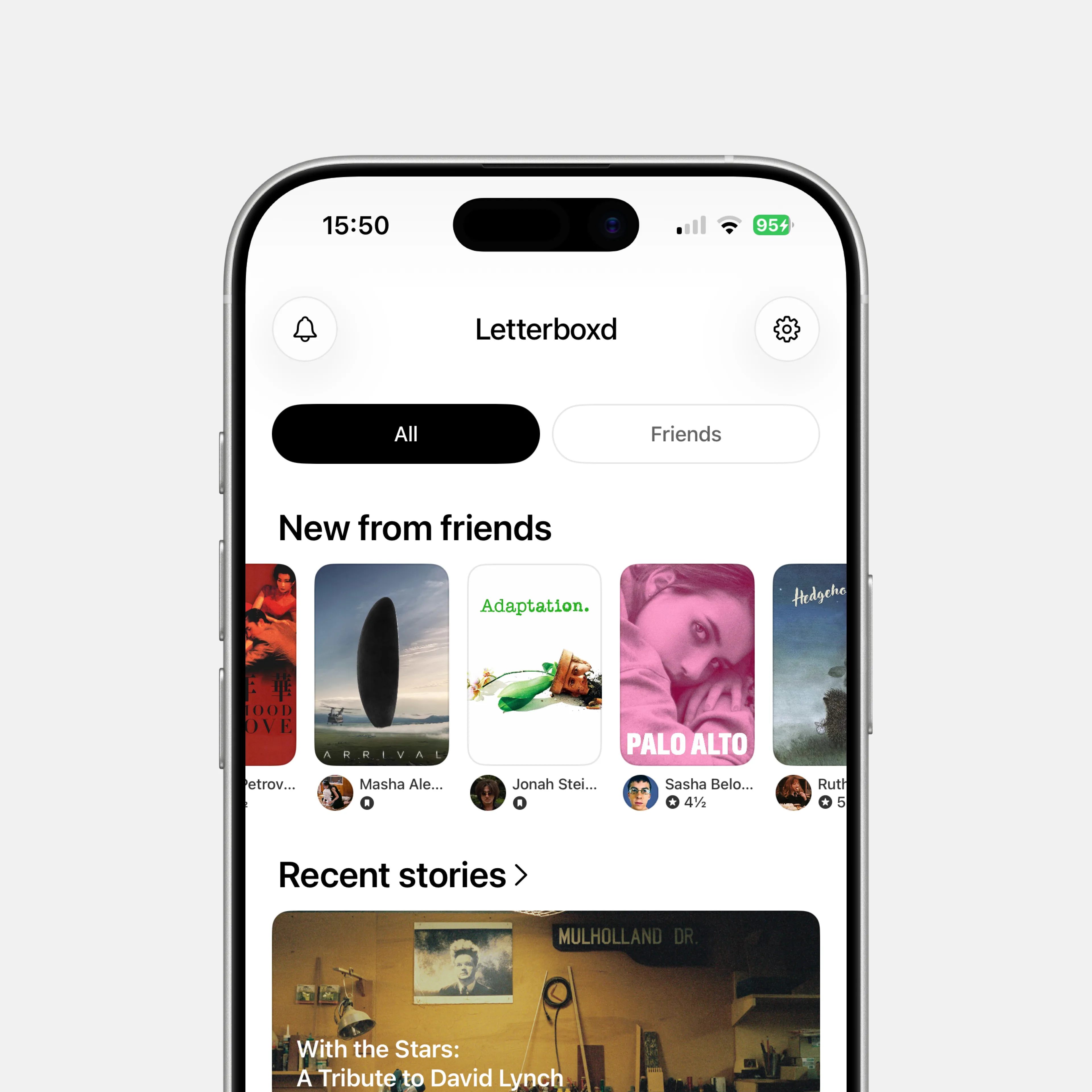
In the first tab, the feed would be shaped around the user's interests — friends' activity, articles, lists, exclusive content, and more.
In the second, the focus would be purely on the social side of the product. Letterboxd should let users see only the content tied to their friends and followers, because at its core it is still a social network.
I think a structure like this would make the feed more informative and more engaging for both new and active users.
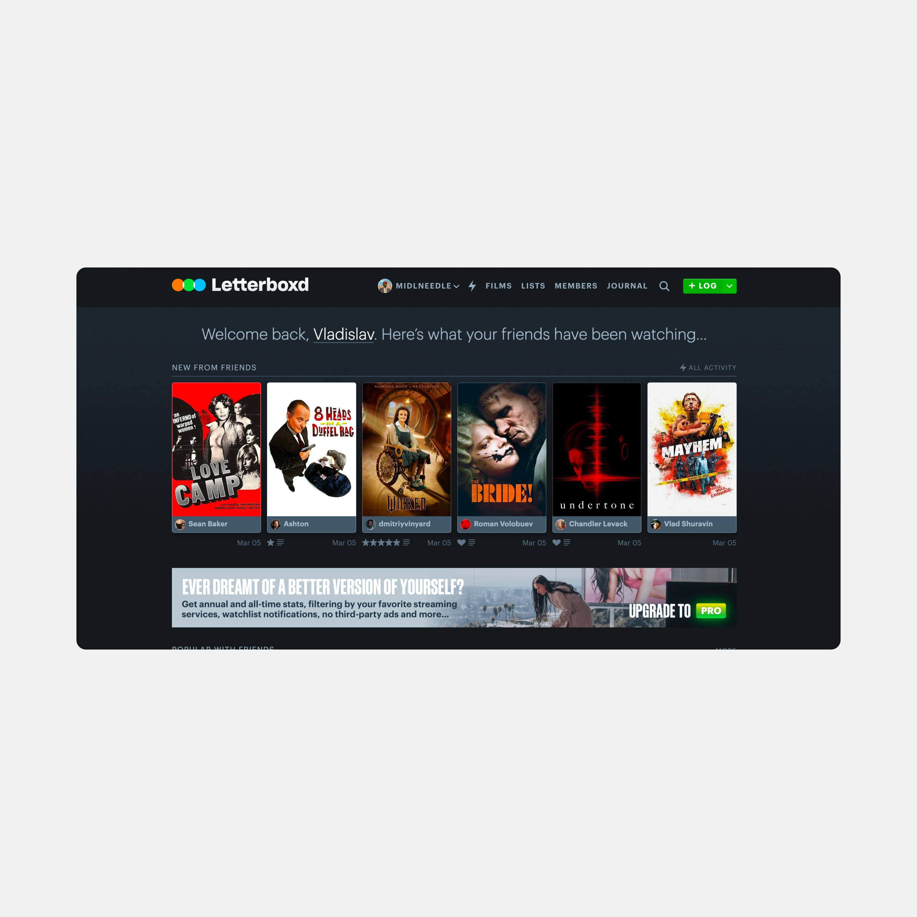
And honestly, the desktop version of Letterboxd already works more like this — it has one feed where films, lists, and articles can coexist. Why the mobile version went in a different direction is a real question.
What else could be added to the feed
I follow Letterboxd's brand accounts on social media, and I think they're run incredibly well. Through them, the company introduces people to films, industry figures, events, and the broader culture around cinema.
It feels like a missed opportunity that at least some of that content doesn't make its way into the app. I wanted to fix that, so I added an events section1. Film festivals happen all year round — Sundance, Berlinale, Cannes — and users should have a way to feel at least a little closer to that world.
Film page
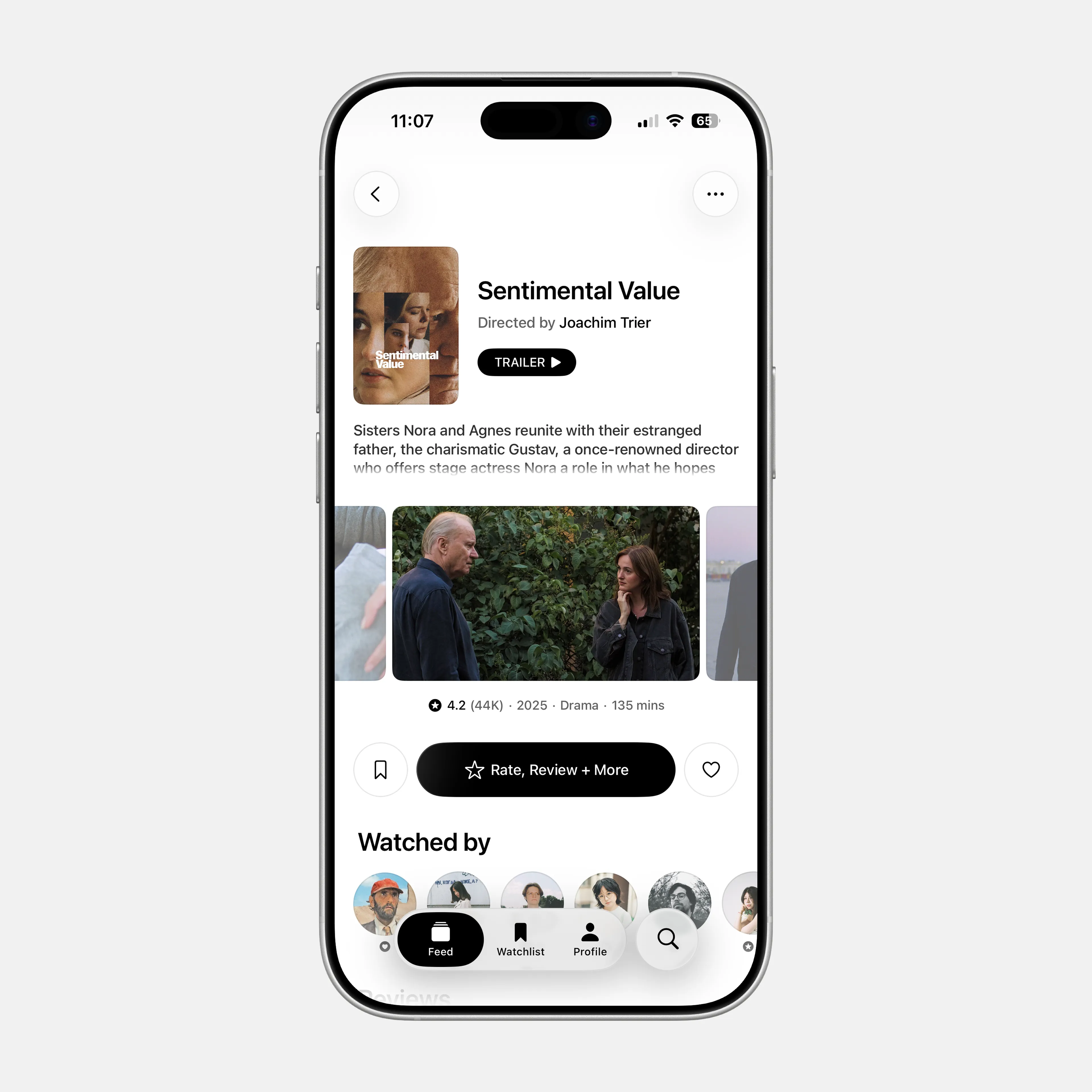
To me, one of the app's most important actions — rating a film — gets lost. The button is small and hides too many actions behind it.
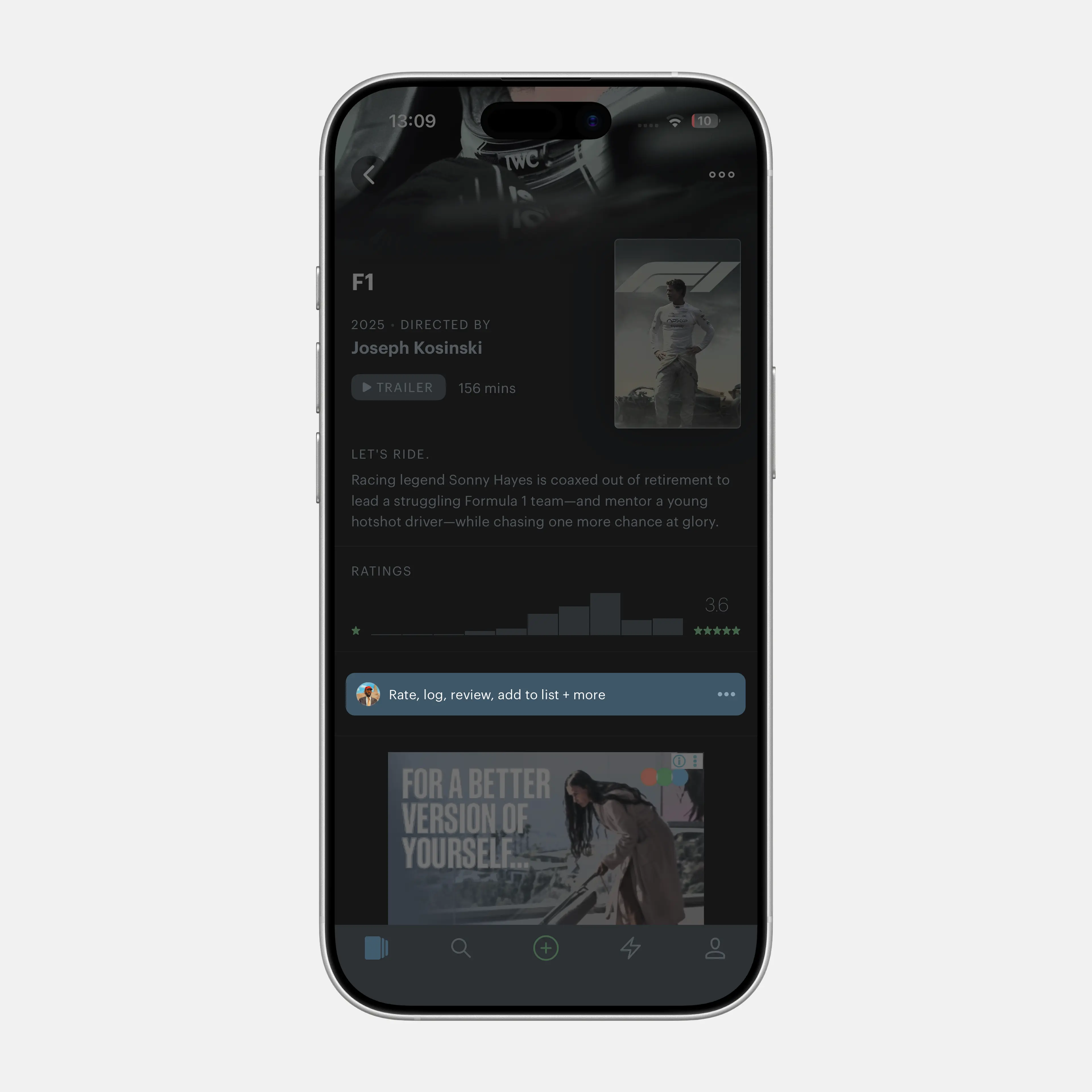
I moved like and watchlist to either side of it to remove a few unnecessary barriers from the most basic interaction, and made the rating button itself more visible and more prominent.
Footnotes
-
The idea came to me when I thought of a somewhat niche Telegram channel called “Cannes Dogs”, where film journalists share behind-the-scenes stories from major festivals. I and a few thousand other movie nerds genuinely love that kind of content. I think an events section like this would work really well in Letterboxd too.